P-chart Maker
Instructions: Use our step-by-step \(p\)-chart maker, by providing your samples, with the number of defectives and the sample size.
Learn more about this P-Chart maker.
This P-chart calculator is one very commonly used graphical tool to assess if a process is in statistical control, usually by analyzing the behavior of the sample proportion of defect across many samples.
The great advantage of using a graphical tool is that you can easily find patterns and identify point that appear to deviate from a "normal" behavior, or more precisely, what would be expected under certain common distributional assumptions.
How do I use this P chart calculator online?
The idea is that you have a list of \(N\) samples, and for each sample you have a number of defectives and the sample size. Usually the sample size is the same for all samples, but it is not always the case.
Then, for each sample you will compute the sample proportion of defectives \(\p_i\). Overall, we will have \(N\) sample proportion of defectives, one for each sample. Finally, you find the mean of the proportion of defectives, which you call \(\bar{p}\).
After you have all that, you can use the following formulas to get the lower and upper control limits for the p-chart
\[ LCL_{p} =\bar{p} - 3\sqrt{\frac{\bar{p}(1-\bar{p})}{k}} \] \[ UCL_{p} =\bar{p} + 3\sqrt{\frac{\bar{p}(1-\bar{p})}{k}} \]where \(k\) is the common sample size of ALL samples that you are working with.
Summarizing: How do you make a P-chart?
Step 1. The first thing you need to do is to collect the data that you want to measure, in this case, the defectives, because you are interested in analyzing the proportion of defectives ultimately.
Step 2. Now, for each sample you compute the sample proportion of defectives (which is, number of defectives divided by sample size) .
Step 3. The next step is to compute the average of all sample proportion of defectives.
Step 4. Then you need to use the formulas for the lower and upper control limits \(LCL_{p} =\bar{p} - 3\sqrt{\frac{\bar{p}(1-\bar{p})}{k}}\) and \(UCL_{p} =\bar{p} + 3\sqrt{\frac{\bar{p}(1-\bar{p})}{k}} \).
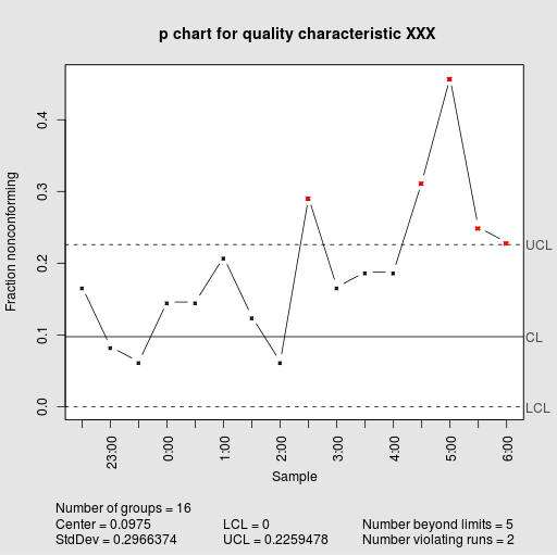
Step 5. Now you construct a chart where you plot the proportion of defectives for each sample, in the form of a line plot, and also you need to plot the lower and upper limits as well, as well as the centerline.
Step 6. In the final step, you determine whether or not any proportion of defectives go beyond any of the control limits.
Those points that go beyond the lower and upper control control limits, if any, are said to be out of statistical control, and also the process is not in statistical control. When no points are out of statistical control, then we say that the process is in statistical control.
Other control chart
You may be interested in using an R chart grapher to assess whether or not the variability of the process is in control. Also, if you need to assess whether the center of the process is in statistical control, you can use this X-bar chart maker .


