X-bar Chart Maker
Instructions: Use our step-by-step \(\bar X\)-chart maker, by providing your samples, each of them with a fixed sample size.
First, indicate the number of samples, and the fixed sample size for all the samples:
More about this Xbar Chart maker
This X bar chart calculator will show you all the steps required to construct an X-bar chart, which is one of the most common charts used to assess whether a process is in control or not.
This is achieved by graphically identifying points that exhibit a variation level that appears to go statistically beyond of what one would consider a "common cause".
What formulas are used for an X Bar Chart?
In this case we assume that we have \(N\) samples, and each sample has a size of \(k\) (where typically \(N\) is much larger than \(k\).
So, for each sample \(i\) we compute its sample mean \(\bar X_i\) and it sample range \(R_i\). Then, you take the average of those to get \(\overline{\overline X}\) and \(\bar R\)
Then, you use the following formula to get lower and upper control limit for the X-bar chart
\[ LCL_{\bar X} = \overline{\overline X} - A_2 \bar R \] \[ UCL_{\bar X} = \overline{\overline X} + A_2 \bar R \]where \(A_2\) is constant that depends on the sample size \(k\) of the samples.
How do you make an X bar chart?
1. The first step is to collect the data, where you collect samples, and each sample has the same sample size.
2. Then, you compute the sample mean and sample range for each of the samples.
3. You compute the grand mean for the sample means and range.
4. Then, you compute the control limits \(LCL_{\bar X} = \overline{\overline X} - A_2 \bar R \) and \(UCL_{\bar X} = \overline{\overline X}\) + A_2 \bar R \).
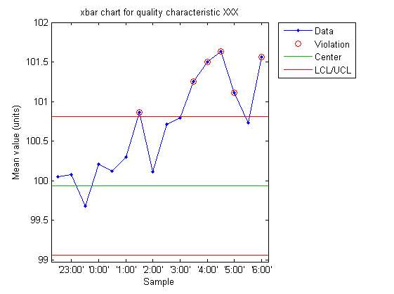
5. Now, you plot each of the sample means in a line plot, and you plot the lower and upper limits.
6. Finally, you assess whether or not any of the sample means go beyond the control limits.
Points that go beyond the lower and upper control control limits are said to be out of statistical control. If no point is out statistical control, then the process is in control.
Other control chart
The Xbar chart is used to assess whether or not the center of the process is in control. If you need to assess whether the variability of the process is in statistical control, you can use this R-chart maker .
Can you make an X bar chart in Excel?
Yes, you need to construct a plot with three constant lines (for the lower, center and upper limits), and another line plot for the plot of sample means.
With this calculator you can directly paste the data you have in Excel is the spreadsheet above, to get automatic, step-by-step calculations.


