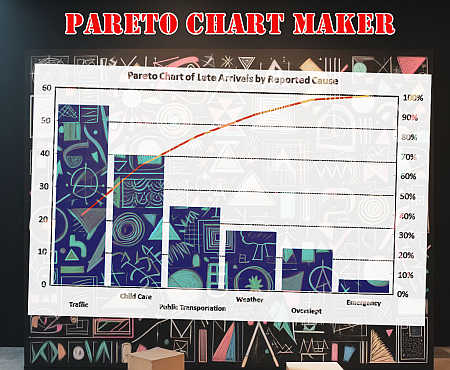
Pareto Chart Maker
Instructions: The following graphical tool creates a Pareto Chart based on the data you provide in the boxes below. All you have to do is type your frequency data and also name of the categories. The tool will deliver a Pareto chart, based on the data entered.
What is a Pareto Chart?
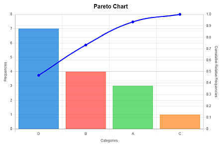
A Pareto chart is a dual chart that puts together frequencies (in decreasing order) and cumulative relative frequencies in the same chart. The purpose of this Pareto Chart is to visually assess which are the most important categories.
How to Construct Pareto Plot?
A Pareto chart is a dual chart that puts together frequencies (in decreasing order) and cumulative relative frequencies in the same chart. The dual part comes from the fact that it is part bar chart and part line chart .
The purpose of this Pareto Chart maker is to visually assess which are the most important categories, with respect to all the categories analyzed, in order to get an "A-B-C" of the most important categories.
In a business context, the more important category are usually the most impactful, which a business should give priority to. The steps to construct a Pareto diagram are shown below:
- Step 1: Sort the frequencies in decreasing order, where the category with the highest frequency goes first.
- Step 2: Plot bars associated to each category. These bars should be decreasing in height
- Step 3: Find the total frequency and calculate relative frequencies
- Step 4: Compute the cumulative relative frequencies
- Step 5: Add a line plot on the secondary axis (the one on the right) to plot the cumulative frequencies
- Step 6: Find the most frequent categories that together cover more than 80% of cases.
Pareto Chart in Excel
It is possible to add a Pareto plot in Excel, but it may take some steps to get it done. You need to first put the data in tabular form, then sort the data, construct relative and cumulative frequencies, add chart types to a chart object, add axes, etc.
So, it is a process that takes a number of steps. With our Pareto calculator, all you do is type the data (or paste it from Excel), and just click on "Graph it". That is it.
What do you use a Pareto Diagram for
One typical application of Pareto charts is for visually conducting an "ABC Analysis", in which the three most important factors in a process are assessed. You can check other of our chart makers, such as our Bar Chart Maker , or Histogram Maker , among our large selection.

