Line Chart Maker
Instructions : Use this line plot maker to create a line chart using the form below. All you have to do is type Y data (and optionally your X labels). Also, you can add a title a name to the axes.
How to use this Line Chart Maker
More about the line charts : A line chart or line plot is a type of graphical representation with the characteristic that the data points are jointed by straight lines.
This kind of setting makes sense in certain circumstances, like for instance in the case of a time series, but in order cases, a scatter plot could be more appropriate (in the case of majority of cross-sectional data).
How do I create a line graph?
In order to create a line graph , you need data for two variables. Indeed, a line chart is constructed by joining a set of pairs \((x_i,y_i)\) by straight lines, starting from the points on the left, towards the right.
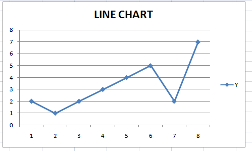
Graphically, a line chart looks like it follows:
Can you create a line chart in Excel?
Absolutely, one of the good things about Excel is that it allows a seamless creation of basics charts, such as it is the case of line charts.
In general terms, you need to use two columns, one for your "X" values, and one for your "Y" values, making sure that each "X" value is paired with one "Y" value.
Our line chart maker though has the advantage that all you need to do is to provide the data in the spreadsheet, and just click on the "Graph it" button. With Excel, you will need to take a few actions before the line chart is presented to you.
How do you create a line chart in Word?
Word is very flexible in terms of the graphs and charts you can create natively, but there is not much of a sense in creating a line chart IN Word, though it is possible.
A much better idea would be to create the line graph in Excel, and then copy and paste it in Word.
Other graph makers
We provide other graph creators such as our normal probability grapher , our Pareto chart maker , time series plot maker or pie chart maker .
Line Graph Examples
There are many example of applications for line graphs. A line chart could be simply used for associate information about two variables, the same way you would do with a scatterplot , but in this case, by joining consecutive points with straight lines.
Example : A study was carried out to explore the connection between the number of hours spent exercising and the heart rate of individuals. The independent variable in this study is the number of hours spent exercising per week, while the dependent variable is the heart rate (in beats per minute).
Construct a line chart for these data.
| Number Of Hours Spent Exercising Per Week | Heart Rate (in Beats Per Minute) |
| 2.51 | 34.92 |
| 3.56 | 47.52 |
| 4.38 | 67.25 |
| 5.14 | 78.84 |
| 5.16 | 103.63 |
| 5.89 | 105.2 |
| 9.65 | 106.09 |
| 10.46 | 112.03 |
| 11.27 | 113.38 |
| 12.17 | 122.23 |
| 12.22 | 126.57 |
| 14.85 | 137.23 |
| 14.9 | 138.03 |
| 15.84 | 144.27 |
| 17.23 | 157 |
| 17.53 | 159.7 |
| 17.94 | 176.68 |
| 18.38 | 178.73 |
| 18.73 | 179.72 |
| 19.67 | 187.36 |
| 19.7 | 198 |
Therefore, based on the information provided above, the following line chart is obtained by simply plotting the Number of hours spent exercising per week data on the X-axis and the Heart rate (in beats per minute) on the Y-axis, and joining the points by straight lines:

Applications of Line Charts
In terms of applications, one specific type of line graph calculator is this ogive graph maker, which is essentially a line plot depicting a cumulative frequency table.
Also, you can have a mix of chart types like it happens in the case of Pareto charts , where a bar chart and a line chart are combined.


