R-chart Maker
Instructions: Use our step-by-step \(R\)-chart maker, by providing your samples, each of them with a fixed sample size.
First, indicate the number of samples, and the fixed sample size for all the samples:
Learn more about this R-Chart maker, in order to understand the results provided by this grapher.
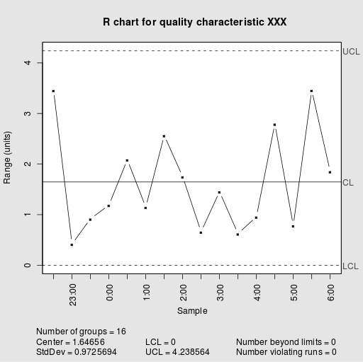
This R-chart creator will provide you with all the steps that are required to construct an R chart, which is commonly used to determine if a process is in statistical control or not.
One benefit of using this kind of graph is that you can directly indicate whether not the process is in control by taking a look and the chart, and graphically identifying points that exhibit level of variation level that seems to exceed what is considered as a "common cause" of variation.
How do I compute an R Chart? What formulas do I use
You will need to provide a certain number of samples, let us say you provide \(N\) samples, and each of the samples has the same sample size, let us say they have a sample size equal to \(k\).
So, for of the samples we need to compute both the sample sample mean \(\bar X_i\) and the corresponding sample range \(R_i\). So that overall, we have \(N\) sample means and \(N\) sample ranges. Finally, you find the mean of sample means, which you call \(\bar{\bar X}\) and the mean of sample ranges, which you call \(\bar R\).
After you have done those calculations, you can use the following formulas to get the control limits (lower and upper) for the R chart
\[ LCL_{R} = D_3 \bar R \] \[ UCL_{R} = D_4 \bar R \]where \(D_3\) and \(D_4\) are constants that depends on the sample size of each of the sample. Those constants need to be found in statistical control tables.
In Summary: How do you make an R chart?
Step 1. You first collect the data of what you are interested in measuring, and you collect a certain number of samples. Here we assume that each sample has the same sample size.
Step 2. After you collect the data, you need to compute the sample mean and sample range, for each of the samples you have.
Step 3. You compute the grand mean for the sample means and range.
Step 4. Then, you use the formulas provided above to compute the control limits \(LCL_{R} = D_3 \bar R \) and \(UCL_{R} = D_4 \bar R \).
Step 5. In a chart, you need to plot each of the sample ranges in a line plot, and you plot the lower and upper limits as well.
Step 6. Finally, in order to determine whether or not any of the sample ranges go beyond the lower and upper control limits.
Those points that go beyond the lower and upper control control limits are out of statistical control. When there are no point that are out of statistical control, then it is said that the process is in control.
Other control chart
The R chart is used to assess whether or not the variability of the process is in control. If you need to assess whether the center of the process is in statistical control, you can use this X-bar chart maker .


