How to Use this Pie Chart Maker.
More information:
What is a pie chart exactly? A pie chart is a type of graphical display suited to exhibit the percentage of the total that corresponds
to various categories.
Each portion of the pie associated to a category represents the percentage of the total, corresponding to that specific category.
Graphically, a pie chart looks like:
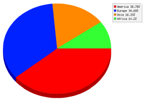
This pie chart creator allows you to provide the names of the categories so that you can enhance the level of customization
you can achieve with this tool.
How to make a Pie Chart
Making a pie chart is easy with our
pie chart generator
. It is as simple as typing the categories and frequencies, or pasting them from Excel,
and you are done.
In terms of the mathematical work you need, you need to take the frequencies and get the total frequencies, by adding them up.
Then, you divide each frequency by the total and multiply by 100, which leads to the percentage of the pie chart that
one specific category uses of the whole pie.
For example, if the total sum of frequencies is 120, and one category has a frequency of 60, you compute 60/120 x 100 = 50%, so you know that
specific category uses half of the pie chart.
What if I need to make pie chart and I don't have grouped data?
One observation: This online pie graph maker assumes that you have grouped data. You can use this other graph maker if you need to construct a
pie chart from raw data
.
Other graphing tools and graph makers
The type of charts you can create will depend on the level of measurement of data you have available. For example, pie chart requires
a list of quantitative data, usually integers representing frequencies, such as 1, 5, 6, etc.
Then, those frequencies are tied to a label, which is a variable measured at the nominal level.
This pie chart generator is only one out of our many graph makers. Our site provides many other graph creators, such as our
scatter plot maker
,
Pareto chart maker
,
pie chart maker
and a
bar chart maker