Frequency Polygon Graph Maker
Instructions: Use this Frequency Polygon Graph Maker to construct a frequency polygon based on a sample provided in the form of grouped data, with classes and frequencies. Please type those classes and frequencies in the form below:
More about this Frequency Polygon Graph Maker
The idea of having grouped data is most of the time to summarize a sample, frequently using measures of central tendency, measures of dispersion and charts.
One of those charts that describe the sample is the frequency polygon , which gives you a quick snapshot of the distribution of the values in a sample.
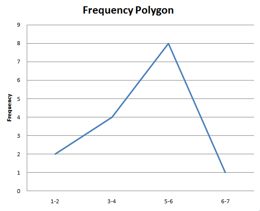
Graphically, a frequency polygon would look like this:
How do you actually construct a frequency polygon?
A frequency polygon is actually pretty easy to construct:
First, you need to have the frequency distribution of the data, either in terms of the frequency of individual values, or in terms of classes.
Second, you put the classes (or individual values) on the X-axis, and their frequencies on the Y-axis, and graph all the corresponding (X, Y) points.
Third, you join those points by straight lines, starting from the points on the left, to the right.
That is exactly what this frequency polygon maker does for you, and most statistical software packages (like Excel) can do for you.
Now, if you instead need to graph a cumulative frequency polygon, you will need instead this ogive graph maker .
Once you have set the chart up, you will get a good perspective of what the distribution looks like, especially if the sample size is large enough. Indeed, for example, if you have a sample size that is large enough (say n = 50) and you have a sample that comes from normal distribution population , then the frequency polygon should look fairly bell-shaped.
Other descriptive statistics chart makers
Chart makers are really important at the time of getting a quick but reasonably appropriate description of the shape of the distribution of the random variable that is being sampled.
You may be interested in taking a look at our histogram maker , which possibly gives you a more accurate depiction of the shape of the distribution. You can also use this pie chart maker or box plot maker , for the appropriate level of measurement.


