Relative Frequency Graph Maker
Instructions: Use this Relative Frequency Graph Maker to create a bar chart with relative frequencies associated to sample data provided in the form below. This sample needs to be comma or space separated:
Relative Frequency Graph Maker
This calculator allows you to construct a relative frequency bar chart based on the data that you type or paste in the spreadsheet above. This data needs to be numeric (valid numbers).
Once you have entered the data you want to use to construct the chart, all you have to do is click on the "Graph it" button.
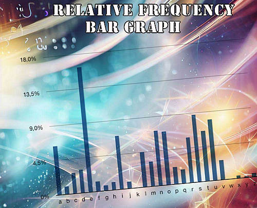
What is a Relative Frequency Bar Graph?
A relative frequency graph is a type of bar chart that shows the relative frequencies corresponds to the values in a sample, with respect to the total number of sample data.
It allows you to see the proportion or percentage that one value is repeated among all the elements in the sample. Unlike the frequency chart , it gives a relative perspective of the frequencies of the values instead of an absolute one.
How do you draw a relative frequency bar graph?
When drawing a relative frequency bar graph, you need to:
- Tabulate the corresponding values in the dataset
- Tally up the times each value repeats itself
- Determine the frequency associated to each value in the dataset
- Determine the relative frequencies by dividing the corresponding frequencies by the total number of values in the dataset, this is the sum of all frequencies
- Draw bars for all values with a height that is proportional to its relative frequency
When considering working with classes instead, you should consider instead this histogram maker , or even this frequency polygon maker , which will work with interval classes that will give a better perspective of the distribution the sample data was drawn from.
How is a relative frequency histogram different from a bar chart?
A relative frequency histogram is a just a type of bar chart , in which the bar have a specific meaning, which is the relative frequency with respect to the total number of values.
So then, it is convenient to think of a relative frequency histogram as a bar chart for which the bar have a special meaning, but it is ultimately a type of bar chart.


