Power Regression Calculator
Instructions : Use this tool to find a power regression model for given data. Please provide your \(X\) and \(Y\) paired data and a scatterplot with and power regression curve will be added to it. Optionally, you can add a title and a name for the axes.
Power regression calculator online
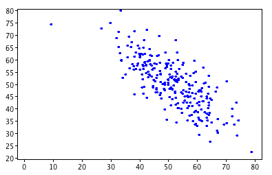
First of all, one of the main tools to asses the type of association between two variables is using a scatter plot.
Whenever the scatter plot looks more or less like a straight line, then a traditional linear regression model is what should be used, using Excel, or your favorite calculator.
But that is not always the case: this is, not always when you plot a scatterplot you will see a clear linear pattern. Indeed, sometimes you will fairly non-linear patterns, for which a traditional linear regression model would be pretty pretty wrong.
Power Regression FOrmula
So, how does a power regression looks like? Well, that is the first question we have to address. A power regression equation has the following structure:
\[\hat y = A x^{b} \]Simple, huh? But then, how do you actually estimate the parameters \(A\) and \(b\)? The short answer is, you run a regression for \((\ln X, \ln Y)\) data, instead of \((X, Y)\).
What does this mean? You first TRANSFORM the \((X, Y)\) into \((\ln X, \ln Y)\), and then you run a regression for these new transformed data. The slope of this auxiliary regression will be the estimated \(b\), whereas the exponential of the estimated intercept of the auxiliary regression will be the estimated \(A\)
Power Regression Graph
The power regression graph shows a non-linear type of pattern that behaves different from the normal linear pattern. The result of this generator is shown in the graph that is generated, with the scatterplot points and the power regression chart
If the power regression chart passes close to the given \((X, Y)\) points, then the power regression is a good model for this data. If not, probably a different model should be attempted.
Can you do a power regression by hand?
It is possible, but not advisable, as many non-trivial mathematical calculations are required. You are much better off using this calculator, so you don't burden yourself with the mathematical details.

What is the difference between power regression and exponential regression?
We are talking about two completely different models. A power regression model has a structure of the form:
\[\hat y = A x^{b} \]whereas an exponential regression model has a structure of the form:
\[\hat y = A e^{r x} \]so aside from being both non-linear, the two models are not quite the same.
Other graphical tools
If you want to assess a the pattern of the association of a pair of variables, without assuming any specific model you can use our scatterplot generator
On the other hand, if you believe that a simple linear regression is appropriate then you should consider our simple linear regression calculator .
Now, there is also the possibility of getting some non-linearities that are neither exponential models nor power models, in which case you can use our polynomial regression model


