Ogive Graph Maker
Instructions: Use this Ogive Graph Maker to construct a cumulative frequency polygon based on a sample provided in the form of grouped data, with classes (organized in ascending order) and frequencies. Please type those classes and frequencies in the table below:
More about this Ogive Graph Maker
The concept of the ogive graph comes related with the concept of cumulative frequency graph. Indeed, ogive is short name for a cumulative frequency polygon .
It will serve a purpose of giving you a strong idea of the distributional properties of sample data, although you will rarely rely on an ogive alone to make the distributional conclusions.
What is an ogive on a graph?
The idea of an ogive chart comes up from using a cumulative polygon is a way of assessing which how the frequencies of the classes stack up in relative terms, given you yet another dimension of distribution you are studying.
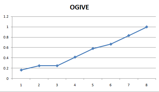
Graphically, an ogive looks like:
How do you construct an ogive chart?
There are several steps, but it is essentially the same procedure as the one followed to construct a frequency polygon , only with an added step:
Step 1 : You need to have the classes and their corresponding frequencies, where the classes are in ascending order.
Step 2 : You need to construct the cumulative frequency for each class, by adding all the frequencies up to a given class.
Step 3 : The classes go on the X-axis, and the associated cumulative frequencies go on the Y-axis. Then you graph all the points (X, Y) corresponding to the classes and the cumulative frequencies . For a class, the X point is build on the midpoint of the class.
Step 4 : Join these (X, Y) points together using straight lines, with the points in the foremost left first, and moving to the right.
These are the steps followed by our ogive maker, and the end result will look like the graphs shown above. To complete the same task, you can use any statistics software packages, including Minitab, Excel and SPSS.
Observe that the ogive is made up of these straight lines joining discrete points, because we are in this case dealing with a discrete sampling chart. If we were dealing with calculating normal probabilities , for example, we could draw a continuous curve for the theoretical cumulative normal distribution .
What is the importance of an ogive graph
- It provides a neat graphical way to depict cumulative frequencies
- It provides a different visual perspective to what the cumulative frequency chart gives
- The information provided by the ogive can be interpreted further by the inclination of the ogive lines
Can you an Ogive graph Excel
Definitely! You need to following these steps:
- Get the sample data and create a frequency table from it
- Construct a column with the corresponding cumulative frequency
- Now you take the data values in the X axis and the cumulative frequency on the Y axis and construct a line graph
- There you have your ogive
Related chart makers
Typically, the measures of descriptive statistics come along with different charts that represent the distribution of the sample drawn.
Different charts you may be interested in are the histogram and the box plot , which provide a clear snap view of basic parameters of a distribution.


