Figure 1.13 (below) is a time plot of the average price of fresh oranges each month during the decad
Question: Figure 1.13 (below) is a time plot of the average price of fresh oranges each month during the decade from 1992-2002. The prices are index numbers given as percents of the average price during 1982-1984.
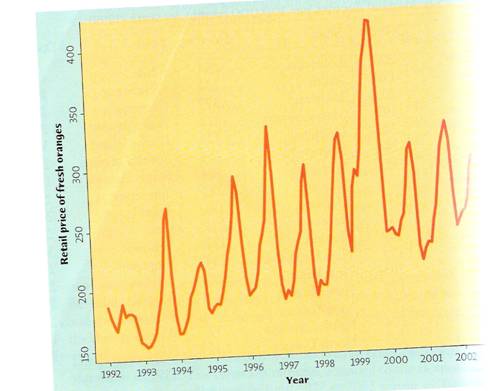
a) The most notable pattern is seasonal variation, regular up and down movements that occur at about the same time each year. Why should we expect the price of fresh oranges to show seasonal variation?
b) Is there a longer-term trend visible under the seasonal variation? If so, describe it.
Price: $2.99
See Solution: The solution consists of 2 pages
Solution Format: Word Document
Solution Format: Word Document
-
 Why would one want to use this method and what advantages does it offer as an applied tool? #1680") (See Solution) Why would one want to use this method and what advantages does it offer as an applied tool? #1680
(See Solution) Why would one want to use this method and what advantages does it offer as an applied tool? #1680
-
[Solution] The following table shows the number of applicants accepted and refused by different graduate progra #1218
-
[Solution] Rolf Steps is the production manager for a local manufacturing firm. This company produces staplers #2259
-
[Solved] What are the two ways government can finance a budget deficit? #4874
-
Free Math Help
-
Math and Statistics Solutions
 Why would one want to use this method and what advantages does it offer as an applied tool? #1680")


