Box Plot Maker
Instructions: The following graphical tool creates a box plot on the data you provide in the boxes. Use the spreadsheet below to provide (type or paste) one or more samples. Please press the button below to add a sample (up to 5). Right click on the headings to edit the sample names if needed.
More About this Box Plot Maker
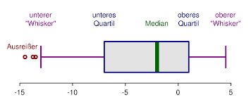
What is a boxplot? A box plot is a chart tool used to quickly assess distributional properties of a sample. The so-called box-and-whiskers plot shows a clear indication of the quartiles of a sample as well of whether or not there are outliers.
What is the structure of a box-plot?
This is how you make a box plot: There are different conventions, but the most common one indicate that the central box limits are determined by the quartiles \(Q_1\) and \(Q_3\).
Inside of the central box there is line that represents the median (which is the same as \(Q_2\)). The whiskers are expressed in different ways, but one of the most common ways set the limit of the upper whisker as \(Q_3 + 1.5 \times IQR\), and the limit of the lower whisker as \(Q_1 - 1.5\times IQR\), where \(IQR\) is the interquartile range, that is defined as: \(IQR = Q_3 - Q_1\)
So then, the boxplot is constructed tightly based on the information provided by the 5 number summary .
How do you use this box plot calculator
All you have to do is to type the same data in the box above, separated by commas or spaces. Typically, you will use it to calculate one box plot, but you can type "\" and start a new sample, if you want to calculate multiple box plots.
Is this the same as a Box and Whisker Plot?
Yes, that is right. A box-plot maker is a different name for a box and whisker plot maker. The box part of the name comes obviously from the box that is constructed based on the quartiles, and the whiskers are the lines that represent the distance from quartiles to max/min, except for the case that there are outliers.
Can you compute a Box plot with the mean and standard deviation
No. The boxplot does not use the mean or standard deviation, it is based on the quartiles, as well as the maximum and minimum. Why is that? Because quartiles (Q1, Median and Q3) are more robust to outliers than the mean and standard deviation are.
Are there any other graph makers of interest?
This box plot generator is only one graphing tool we have available in our website. Among our many graph makers available, you can use a normal graph maker , scatter plot maker or Pareto chart maker , among many others.
Box plot generator in Excel
One of the notorious graphs that is not provided out of the box by Excel is the box-plot, and you cannot do it directly, and you need to conductance manually many actions. Also, not to mention that Excel provides a simplified version of quartile calculation that is not totally accurate.
The advantage of this calculator is that you only need to provide the data into the form (which you can do by pasting the data from Excel, and this solver will show you how the box-plot graph is constructed, step-by-step.