Box and Whisker Plot
The Box and Whisker Plot, or also known as Box-plot, is a type of graphical depiction of a sample, that provides easy to see key features of the distribution of a sample.
![]() A box-and-whisker plot provides the median as well as the first and third quartiles in its "box", and the minimum and maximum
in the "whisker".
A box-and-whisker plot provides the median as well as the first and third quartiles in its "box", and the minimum and maximum
in the "whisker".
![]() When the minimum or maximum are too extreme, the "trim" the whisker and we annotate the existence of an outlier.
When the minimum or maximum are too extreme, the "trim" the whisker and we annotate the existence of an outlier.
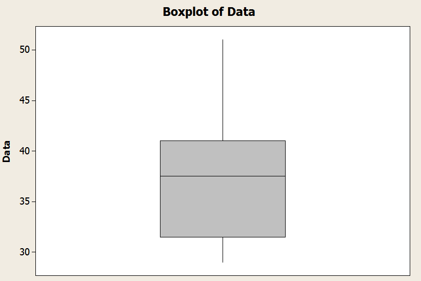
In the graph above you have an example of a how a boxplot looks like: You have the "box" and the whiskers.
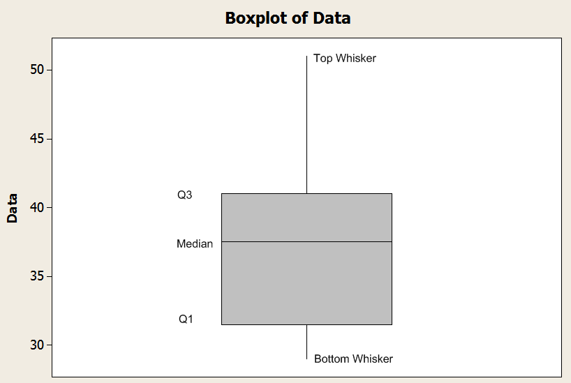
![]() The bottom line of the box is defined by the first quartile (\(Q_1\)).
The bottom line of the box is defined by the first quartile (\(Q_1\)).
![]() The middle line of the box is defined by the median (\(Q_2\)).
The middle line of the box is defined by the median (\(Q_2\)).
![]() The top line of the box is defined by the third quartile (\(Q_3\)).
The top line of the box is defined by the third quartile (\(Q_3\)).
Now, for the whiskers there is a rule to follow: the bottom whisker is defined by the minimum of the sample, and the top whisker is defined by the maximum of the sample. This is provided that the size of the whisker is smaller than \(1.5 \times IQR\), where \(IQR\) is the interquartile range, and it is defined by \(IQR = Q_3 - Q_1\).
See the sample graph below.
![]() So then, if the minimum of the sample is greater than \(Q_1 - 1.5 \times IQR\), then the lower whisker is defined by the minimum. Otherwise, it is defined by \(Q_1 - 1.5 \times IQR\).
So then, if the minimum of the sample is greater than \(Q_1 - 1.5 \times IQR\), then the lower whisker is defined by the minimum. Otherwise, it is defined by \(Q_1 - 1.5 \times IQR\).
![]() Similarly, if the maximum of the sample is less than \(Q_3 + 1.5 \times IQR\), then the top whisker is defined by the maximum. Otherwise, it is defined by \(Q_3 + 1.5 \times IQR\).
Similarly, if the maximum of the sample is less than \(Q_3 + 1.5 \times IQR\), then the top whisker is defined by the maximum. Otherwise, it is defined by \(Q_3 + 1.5 \times IQR\).
Graph Makers
Constructing a box plot can be algebraically involved in done by hand, in the sense that lots of calculations are needed. You can be better off by using a box and whisker plot calculator such as ours, which will show you all the steps after just clicking the button.
There are lots of descriptive statistics charts that are very useful but they are algebraically laborious to construct, for which it would be advisable to use a suitable calculator, at least to check your results if you decide to do them by hand.
EXAMPLE 1
Construct a box-plot for the following sample:
28, 36, 43, 30, 46, 19, 46, 36, 34, 38, 42, 29, 37, 35, 39, 39, 30, 39, 36, 38, 30, 41, 42, 46, 40, 33, 30, 40, 43, 30, 42, 39, 30, 35, 38, 41, 30, 37, 40, 30, 30, 35, 39, 37, 42, 42, 37, 38, 32, 51
ANSWER:
We get that the maximum and minimum are
\[\min = 19\] \[\max = 51\]The following table shows the data in ascending order:
|
Data (In ascending order) |
|
19 |
|
28 |
|
29 |
|
30 |
|
30 |
|
30 |
|
30 |
|
30 |
|
30 |
|
30 |
|
30 |
|
30 |
|
32 |
|
33 |
|
34 |
|
35 |
|
35 |
|
35 |
|
36 |
|
36 |
|
36 |
|
37 |
|
37 |
|
37 |
|
37 |
|
38 |
|
38 |
|
38 |
|
38 |
|
39 |
|
39 |
|
39 |
|
39 |
|
39 |
|
40 |
|
40 |
|
40 |
|
41 |
|
41 |
|
42 |
|
42 |
|
42 |
|
42 |
|
42 |
|
43 |
|
43 |
|
46 |
|
46 |
|
46 |
|
51 |
The median is then
\[Median=\frac{{37}+{38}}{2}=37.5\]The position of the 25-th percentile is
\[{{L}_{25}}=\frac{P}{100}\times \left( n+1 \right)=\frac{25}{100}\times \left( 50+1 \right) = {12.75}\]Then, we get that
\[{{Q}_{1}}={30} +{0.75}\times \left( {32}-{30} \right) = {31.5}\]The position of the 75-th percentile is
\[{{L}_{75}}=\frac{P}{100}\times \left( n+1 \right)=\frac{75}{100}\times \left( 50+1 \right) = {38.25}\]Then, we get that
\[{{Q}_{3}}={41}+{0.25}\times \left( {41}-{41} \right) = {41}\]Hence, the 5-number summary is
\[\min = 19, Q_1 = 31.5, Q_2 = 37.5, Q_3 = 41, \max = 51\]The interquartile range in this case is \(IQR = Q_3 - Q_1 = 41 - 31.5 = 9.5\). Hence,
![]() \(Q_1 - 1.5 \times IQR = 31.5 - 1.5 \times 9.5 = 17.25\)
\(Q_1 - 1.5 \times IQR = 31.5 - 1.5 \times 9.5 = 17.25\)
![]() \(Q_3 + 1.5 \times IQR = 41 + 1.5 \times 9.5 = 55.25\)
\(Q_3 + 1.5 \times IQR = 41 + 1.5 \times 9.5 = 55.25\)
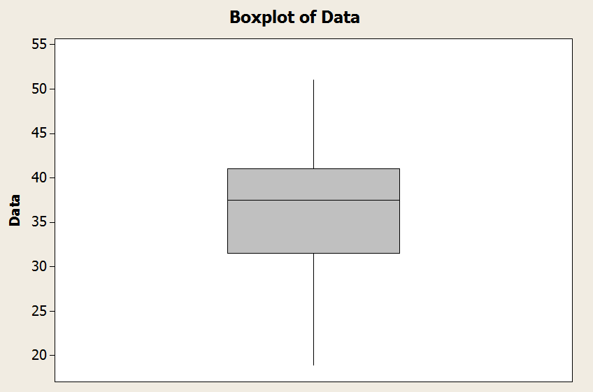
Observe that the minimum is 19, and it is greater than \(Q_1 - 1.5 \times IQR = 17.25\). And the maximum is 51, and it is lower than \(Q_3 + 1.5 \times IQR = 55.25\).
We conclude that the lower whisker is the minimum, and the top whisker is the maximum in this case. Graphically
EXAMPLE 2
Find the box plot for the same sample from the previous example, but when you replace "51" by "81".
ANSWER:
We get that the maximum and minimum are
\[\min = 19\] \[\max = 81\]The following table shows the data in ascending order:
|
Data (In ascending order) |
|
19 |
|
28 |
|
29 |
|
30 |
|
30 |
|
30 |
|
30 |
|
30 |
|
30 |
|
30 |
|
30 |
|
30 |
|
32 |
|
33 |
|
34 |
|
35 |
|
35 |
|
35 |
|
36 |
|
36 |
|
36 |
|
37 |
|
37 |
|
37 |
|
37 |
|
38 |
|
38 |
|
38 |
|
38 |
|
39 |
|
39 |
|
39 |
|
39 |
|
39 |
|
40 |
|
40 |
|
40 |
|
41 |
|
41 |
|
42 |
|
42 |
|
42 |
|
42 |
|
42 |
|
43 |
|
43 |
|
46 |
|
46 |
|
46 |
|
81 |
The median is then
\[Median=\frac{{37}+{38}}{2}=37.5\]The position of the 25-th percentile is
\[{{L}_{25}}=\frac{P}{100}\times \left( n+1 \right)=\frac{25}{100}\times \left( 50+1 \right) = {12.75}\]Then, we get that
\[{{Q}_{1}}={30} +{0.75}\times \left( {32}-{30} \right) = {31.5}\]The position of the 75-th percentile is
\[{{L}_{75}}=\frac{P}{100}\times \left( n+1 \right)=\frac{75}{100}\times \left( 50+1 \right) = {38.25}\]Then, we get that
\[{{Q}_{3}}={41}+{0.25}\times \left( {41}-{41} \right) = {41}\]Hence, the 5-number summary is
\[\min = 19, Q_1 = 31.5, Q_2 = 37.5, Q_3 = 41, \max = 81\]The interquartile range in this case is \(IQR = Q_3 - Q_1 = 41 - 31.5 = 9.5\). Hence,
![]() \(Q_1 - 1.5 \times IQR = 31.5 - 1.5 \times 9.5 = 17.25\)
\(Q_1 - 1.5 \times IQR = 31.5 - 1.5 \times 9.5 = 17.25\)
![]() \(Q_3 + 1.5 \times IQR = 41 + 1.5 \times 9.5 = 55.25\)
\(Q_3 + 1.5 \times IQR = 41 + 1.5 \times 9.5 = 55.25\)
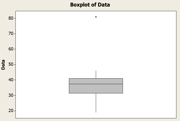
Observe that the minimum is 19, and it is greater than \(Q_1 - 1.5 \times IQR = 17.25\). But now the maximum is 81, which exceeds \(Q_3 + 1.5 \times IQR = 55.25\). Hence, the value "81" is an outlier.
We conclude that the lower whisker is the minimum, and the top whisker is defined by \(Q_3 + 1.5 \times IQR = 55.25\). Graphically
More About the Boxplot
The main question people have is what do boxplots tell you. What do they represent. And the answer is simple: they give you a summarized depiction of the distribution of a sample by provided an schematic graph showing the relative position of the 5-number summary .
This way, you can scan for outliers , you can assess the degree of skewness of the distribution, and you can quickly scan regions have 25%, 50% and 75% of the total distribution.
Difference between Box-plot and Histogram
One of the things about the box plot is that it provides information that is slightly different than the information provided by a histogram.
Indeed, the histogram shows the raw shape of the distribution, based on the classes used to classify the possible values of the random variable. On the other hand, the boxplot provides summarized information about the quartiles and the 5-number summary, which tells you a lot about the relative position of the first and third quartile with respect to the median.
So in other words, the boxplot, unlike the histogram, presents a graph that represents a summary of the distribution , rather than a raw depiction. The only raw values that would go in a boxplot would the outliers (if there is any).
Applications
The most classical application for the box plot is for detecting outliers. By definition, the box-plot limits the size of the whiskers to 1.5 times the interquartile range \((IQR)\) from the ends of the box (which are defined by \(Q_1\) and \(Q_3\).
So, then, any points that go beyond of the maximum size of the whiskers will be annotated in the box-plot and it will be considered an outlier.
Practice the concepts you have learned in this tutorial by using this box-plot maker . Another graph maker that will allow to see in one glimpse the distributional properties of the distribution of a sample is this histogram maker , or this stem-and-leaf plot maker .