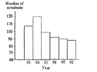
The bar graph below shows the number of car accidents occurring in one city in each of the years 199
Question: The bar graph below shows the number of car accidents occurring in one city in each of the years 1993 through 1998. The number of accidents dropped in 1995 after a new speed limit was imposed. Why is the graph misleading? How would you redesign the graph to be less misleading? Explain your thinking.
Price: $2.99
See Answer: The downloadable solution consists of 1 page
Deliverables: Word Document
Deliverables: Word Document
-
 In any standard Normal model, find the value(s) of z which cuts off the middle 96% of the region. #995") (See Solution) In any standard Normal model, find the value(s) of z which cuts off the middle 96% of the region. #995
(See Solution) In any standard Normal model, find the value(s) of z which cuts off the middle 96% of the region. #995
-
(Solved) Alternate Sources of Fuel. Eight five percent of Americans favor spending government money to develo #25784
-
Solution: Classify the following as independent or dependent samples: (6 pts - 2 pts. ea.) a. The effectivenes #16460
-
(See Solution) An economist claims that when the Dow-Jones average increases, the number of block trades of 10,000 #26435
-
Free Math Help
-
Math and Statistics Solutions
 In any standard Normal model, find the value(s) of z which cuts off the middle 96% of the region. #995")
 Alternate Sources of Fuel. Eight five percent of Americans favor spending government money to develo #25784")
 a. The effectivenes #16460")
 An economist claims that when the Dow-Jones average increases, the number of block trades of 10,000 #26435")

