Pie Graph Maker for Sample Data
Instructions : The following Pie Chart Maker for raw data creates a pie chart based on sample data you provide in the form below. This calculator will find the frequency of each value in the sample, and it will construct a neat pie chart to depict those frequencies.
About this Pie Chart Maker
A pie graph is a graphical device that divides to the full circle (the "pie") into the categories being analyzed, based on the percentage of the total that each category corresponds to
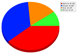
Graphically, a typically pie graph will look like this:
Using this online pie chart maker you will be able to provide a sample with data, and the calculator will create a frequency table (with the corresponding relative frequencies), and from this a pie chart will be derived.
What if I need to make pie chart for grouped data?
This is usually the most common way, in which you have a bunch of categories and the corresponding frequencies for each category. In that case you can used the regular pie chart maker for grouped categories..
Other graphing tools and graph makers
Our site has many graph makers that you could be interested in. Most of them are related with the depiction of descriptive statistics from a provided sample.
For example, you can use our line chart maker , our bar chart maker or our histogram maker , depending on the structure of the data that you have available.


