(Solved) 1. Use the data in the file 'Survey Prep for DDXL.xls' - #80089
Descriptive Statistics -- DDXL and Boxplots
Instructions
1. Use the data in the file 'Survey Prep for DDXL.xls'
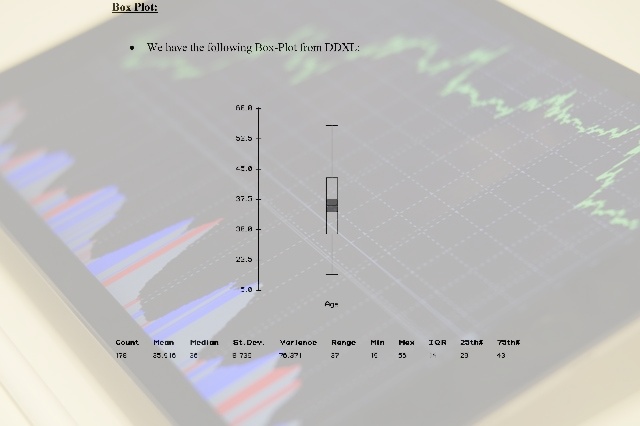
2. Draw a Boxplot of the 'Age' variable.
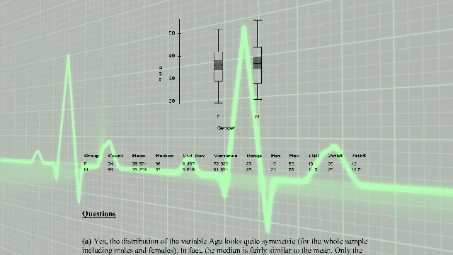
3. Draw two Boxplots in the same figure, one of the 'Age' variable for the females and one of the 'Age' variable for the males.
4. Answer the Following Questions
a. Looking at the result from #2 above, does the distribution of "Age" seem symmetric? Why?
b. Based on the results from Instruction 3, who seem to be older, the males or the female students? Why?
c. What can you say about the shaded part of the boxplots? What do they mean? Will this change your answer to the previous question?
5. To hand in
a. Boxplots
b. Answers to questions 4.a through 4.c.
6. Some help with DDXL (in case you need it!)
Step 1. Open the MS Excel file "Survey prep for DDXL.xls."
Step 2. Highlight the two columns headed by "Gender" and "Age."
Step 3. Click "DDXL" on the menu bar at the top of MS Excel.
Step 4. Choose "Charts and Plots" form the submenu.
Step 5. Choose Boxplot
Step 6. Click on "Age" in the "Names and Columns" area.
Step 7. Click the blue arrow to move the variable "Age" to the area "Quantitative Variables."
Step 8. Click "OK."
For Instruction 3, repeat steps 1 through 7, but in Step 5 choose "Boxplot by Groups."
Step 8 Click on "Gender" in the "Names and Columns" area.
Step 9 Click the blue arrow to move the variable "Gender" to the area "Group Variable."
Step 10 Click "OK."
Deliverable: Word Document
 and pdf


