Polar Plot Maker
Instructions : The following Pie Chart Maker creates a pie chart based on the data you provide in the form below. All you have to do is type your data and the name of the categories. The tool will deliver a pie chart with the corresponding percentages for each category.
How to Use this Polar Plot Maker.
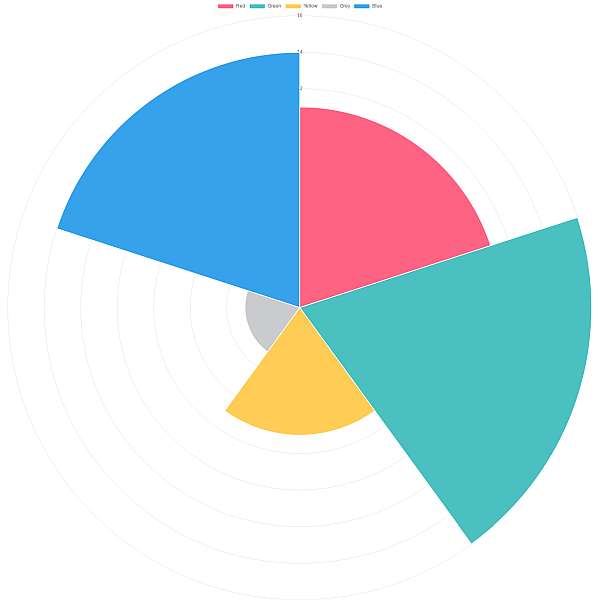
A polar plot is very similar to a pie chart in the sense that both types of charts represent data as slices of a circle.
For a pie chart, the relative differences in frequency are reflected in the angle of the slice, whereas for a polar chart, the difference in frequencies is reflected in the radius of the slice, as all slices have the same central angle.
How do you make a polar plot?
The idea is very similar as what you do for a pie chart: you need to tabulate the data with the pairs Category - Frequency. The main difference is that for a pie chart you compute the central angle for each category, proportionally to its relative frequency.
For a polar plot is different, because it is the radius that is proportional to the relative frequency, and all the categories have the same central angle.
How do you interpret a polar chart?
A polar chart will visually show which categories are the most important ones, based on their relative frequencies. This way, you can tell right away, by simply looking at the graph, which categories are the most important ones.
Other graphing tools for you
A polar chart is not only was to graphically visualize the importance of categories. For example, using similar data you use our , Pareto chart maker also to discriminate the most important categories, or even a simple bar chart maker to compare frequencies represented by the height of the bars.


