Mathcraker is an innovative website that offers a series of tools to help with numerous mathematical problems. Some of these include Graphing tools.
What is a Graphing Tool?
A graphing tool is used to create graphs from numerical data. The tool is programmed with advanced algorithms to plot functions on the coordinate plane.
What's the Benefit of a Graphing Tool by Mathcraker?
The reason for using Mathcraker is that it provides users with several types of graphing tools, which the users can utilize to produce the required graphical illustration. In order to get real-time data from the graph, you should ensure that your internet remains stable since a glitch can cause a bad-read, resulting in an error in the graph.
We'd recommend checking out plans from a top provider such as Xfinity for superb speeds and consistent connectivity. If you want, you can reach out to Xfinity customer service who can hook you up with something reliable right away.
1. Ogive Graph Maker
An ogive graph represents cumulative frequencies, illustrating how the frequencies of any given class stack in relative terms. It’s another term used for cumulative frequency polygon and allows you to get a better idea of the distributional properties of your data.
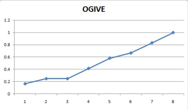
With Mathcracker's Ogive Graph, all you need to add are the relative cumulative frequencies as well as the classes on the given axis, and it will generate the graph right away.
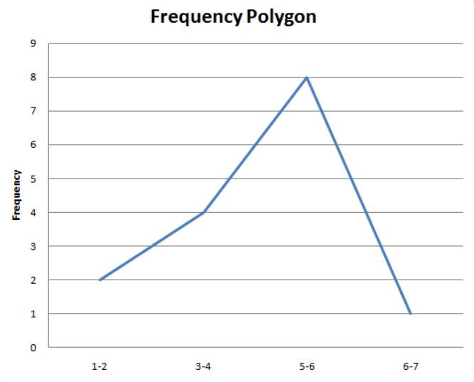
2. Frequency Polygon Graph Maker
Also used for displaying cumulative frequency distribution in the data, a frequency polygon graph is used to compare data sets and is identical to a histogram. Using frequencies and classes, you can create a frequency polygon easily. Or, you can simply add cumulative frequencies and relevant classes in the table given on Mathcracker and it’ll generate the graph for you.
3. Pie Chart Maker
A pie graph is most commonly used for graphical illustrations to represent the portion of the sample belonging to different categories. It's illustrated as a ‘pie slice'; hence, the name. It particularly looks like the one below:
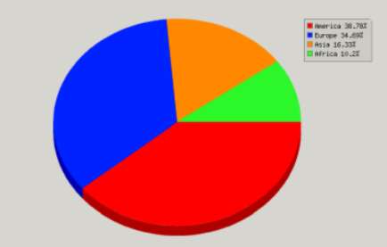
All you need to do is add the sample data, which includes different values for different factors. For instance, you can add the number of users on the X-axis and add their logged working hours on the Y-axis. This will represent the portions that each user holds.
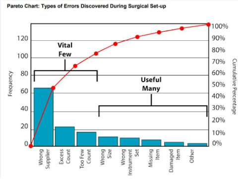
4. Pareto Chart Maker
A Pareto chart uses frequencies in descending order and cumulative relative frequencies and presents them in the same chart. This allows the user to assess the areas of improvement showing the frequency of defects and their cumulative impacts.
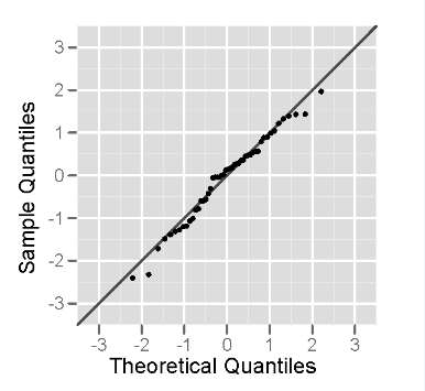
5. Normal Probability Plot
A normal probability plot is used to assess the normality of the distribution from which the passed sample is acquired. Using the graph, the user sets standard normal distribution values against observed values.
How to Use the Mathcracker Graphing Tool?
Using the Mathcraker Graphing tools is quite easy. The tools listed on the website have already been adjusted to pick the data from the user and represent it in the form of a graph.
For instance, if you want to use the Pareto Chart Graph, you'd need to:
- 1. Sort the frequencies in decreasing order i.e., the highest frequency goes first, the lowest goes last.
- 2. Plot bars to each associated category.
- 3. Calculate relative frequencies by finding out total frequencies
and then calculating relative frequencies.
- 4. Use the secondary axis (on the right) to plot a line and to plot cumulative frequencies.
- 5. Frequent categories can be checked that cover more than 80% of the cases.
In other words, you'd need to calculate the necessary data and use it to input the graph's tabular form to generate the required graph easily.
The benefit of Using the Mathcraker Graphing Tool
Mathcracker presents an extensive list of graphing tools that can be used for deducing all kinds of graphical illustrations. The good thing is that the graph is pre-set and will only need the data to create the graph.
It's better than using Excel as you'd need to input data in a tabular form, sort the data, and carry out other operations before you can generate the graph.
Related Calculators
 Write an Academic Essay by Gathering More Information about the Specific Topic - MathCracker.com
In case you have any suggestion, or if you would like to report a broken solver/calculator, please do not hesitate to contact us .